-
GLOBAL
SITE -
LANG
- Select Language
- Afrikaans
- Albanian
- Arabic
- Armenian
- Azerbaijani
- Basque
- Belarusian
- Bulgarian
- Catalan
- Chinese (Simplified)
- Chinese (Traditional)
- Croatian
- Czech
- Danish
- Dutch
- English
- Estonian
- Filipino
- Finnish
- French
- Galician
- Georgian
- German
- Greek
- Haitian Creole
- Hebrew
- Hindi
- Hungarian
- Icelandic
- Indonesian
- Irish
- Italian
- Japanese
- Korean
- Latvian
- Lithuanian
- Macedonian
- Malay
- Maltese
- Norwegian
- Persian
- Polish
- Portuguese
- Romanian
- Russian
- Serbian
- Slovak
- Slovenian
- Spanish
- Swahili
- Swedish
- Thai
- Turkish
- Ukrainian
- Urdu
- Vietnamese
- Welsh
- Yiddish
-
통합검색 활성화
통합검색 닫기
검색창


About GNU
Gyeongnam’s national flagship university representing Korea
Basic System
-
Insignia (symbol mark)
GNU's insignia (symbol mark) has 3 types (Type A to C). Use Type A basically; Type B and C are allowed to be used simultaneously depending on circumstances.

-
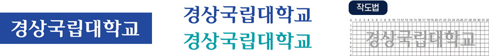
Logotype (Korean)
Logotype is a significant element of UI as well as symbol mark. The logotype in Korean presented in this clause has been separately designed in consideration of the balance of operability with other design elements. Follow the guidelines in use. And also, in case of applications with more than 1,000 mm in width, the accuracy has to be secured in accordance with the design on grid presented below.
-
Logotype (English)
Logotype is a significant element of UI as well as symbol mark. The logotype in English presented in this clause has been separately designed in consideration of the balance operability with other design elements. Follow the guidelines in use. And also, in case of applications with more than 1,000 mm in width, the accuracy has to be secured in accordance with the design on grid presented below.

-
Signature of Korean name plus English abbreviation (horizontal)
English-composited signature refers to the mix of the English mark and the logotype. Korean-English-composited signature is a form that comprises 3 types of GNU logo and the signature of GNU in widthwise direction, and it must not be modified arbitrarily since its own formative rules and proportions are applied in itself.
Korean-English-composited signature: horizontal type (basic)

Korean-English-composited signature (outlined)

-
Signature of Korean name plus English abbreviation (vertical)
Korean-English-composited signature refers to the mix of the English mark and the logotype. Korean-English-composited signature is a form that comprises 3 types of GNU logo and the signature of GNU in widthwise direction, and it must not be modified arbitrarily since its own formative rules and proportions are applied in itself.
Korean-English-composited signature: vertical type (basic)

Korean-English-composited signature: vertical type (outlined)

-
Exclusive font in Korean
The exclusive font is applied to presentation of department names, signs, PRs, promotions, etc. As for other texts, refer to the clause on the designated font.
However, in case that identity damage is expected due to too large a number of letters that require application of the exclusive font, it's allowed to use similar fonts chosen by comparing stroke length, width, height, and design of each letter.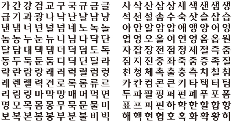
-
Exclusive font in English
The exclusive font is applied to presentation of department names, signs, PRs, promotions, etc. As for other texts, refer to the clause on the designated font.
However, in case that identity damage is expected due to too large a number of letters that require application of the exclusive font, it's allowed to use similar fonts chosen by comparing stroke length, width, height, and design of each letter.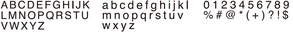
-
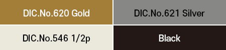
Identity colors
By primarily considering symbolism as well as effects of representation and mix of colors in dye/paint/varnish/electric-display, colors appropriate to apply in media were selected as the identity colors.
Identity colors are categorized into main color and sub color; and they are based on offset printing results with spot inks, which are the most effective method to maintain the sameness of color.
Identity colors are basically supposed to be printed with spot inks; but in case of using media where the spot inks are not available, it's allowed to print with CMYK colors.-
Main Color

-
Sub Color
-